
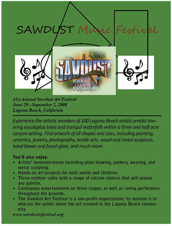
I created an ad for the Sawdust Festival to make it eye catching and useful. The information on the ad is organized and important aspects are bolded or italicized. The color scheme matches that to the actual website and middle picture in the ad. The picture on the top middle is the official logo for the Sawdust Festival and is feathered with a light color to add to the effects. The shapes basically represent the natural creativity involved with this festival.
The shapes are overlapped and give off a sense of simplistic freeform associated with this festival. The music notes on either side immediately let the audience know that this ad is directly associated with music. I left the font black to create a good contrast against the color coordinated background.
The shapes are also in the background so the text and pictures could lie on top creating a well put together display. The color of the lettering in ?Sawdust Music Festival? also goes along with the color scheme of the site and ad combined.
I drew a line under the address and date to make it easier for the reader to get to the information he or she desires to read. The line basically creates a sense of separation for an easy view. Also the cursive font I added to the initial lettering gives the vibe of a non-formal, easy going event that you would go to and have fun. Which should attract more customers/readers than if it were bland.
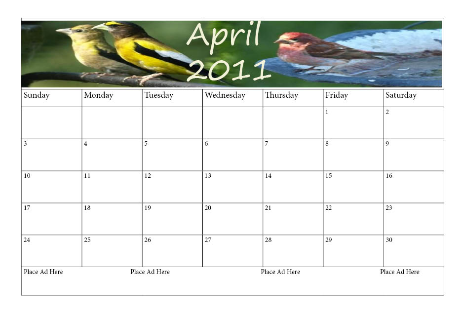
In making my calendars I picked images that were already stretched as if they were used in a banner beforehand. I enlarged my document slightly and chose the landscape option so I could fit the entire calendar on the page. I chose different pictures and font colors for each heading to show creativity. The pictures on top related directly to the humane society for instance animals such as birds, cats, dogs, and rabbits.
The same basic format is used for the 4 months but the banner in the top row is slightly different to also show distinction. I set up the calendars using tables, changing the width of each row according to the content I placed in each Cell in that row. The columns width fit proportionally to the width of the margins on the page. The ad space was also added in as a requirement of the assignment. I left space for 4 different potential ads that could be placed on the bottom of the calendar. The extra days that didn?t correspond to their month I left blank to show which days were actually part of that month. I used a master page to easily structure these four pages changing the banner and days in the month only.
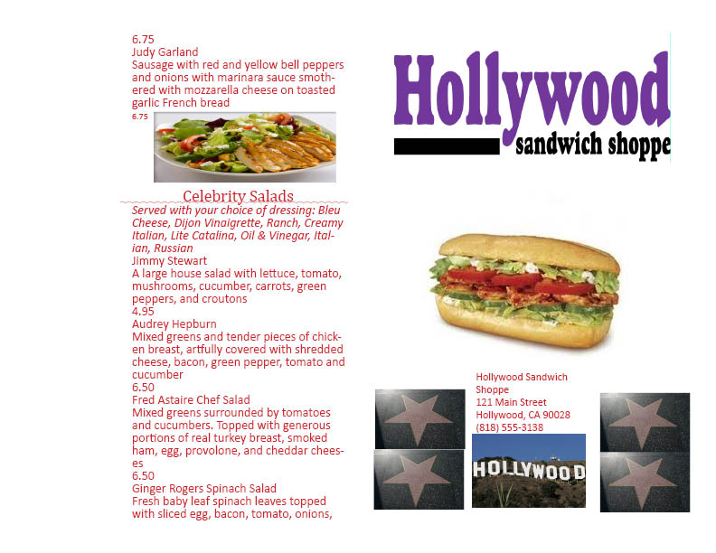
This InDesign project probably took the most amount of time of all the others to complete. We had to make a full menu with the information that was given to us. The layout was up to us to coordinate and most of the design on the front cover. This was a very useful exercise because menus are seen everywhere and a good designer is always needed for them.